MS2 Coursework Evaluation
In this report I am going to be evaluating my AS Media Coursework of a short film that I have made with my media partner, Matt Harwood. It is called Possessions and is about a young boy who is always picked on by his older brother and is never allowed to join in with anything that he does. As he goes around trying to find something to do, he comes across a book that he hasn’t seen before. He then opens the book and finds that there has been something lurking inside and this sprit ends up possessing him. He then runs away from home and his brother realises that he has gone, and this is when the trouble begins.
Intertext research
I first began by looking at different horror films and then put gathered the ideas that I thought would be good and that would work and could use them in my own film. My first points of call for Horror films were: Paranormal Activity, Saw 2, Insidious and The Orphan. I thought that some of the aspects of all of these films could be blended together to make my own film.
Another idea I had was from when I watched the film Julia's Eye’s. I saw that they had used a camera flash to light up a room, and that it was really effective because before every flash you didn’t know what was going to happen when we saw the next flash. I then took this idea and changed it so that we could use it in our film.
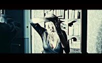
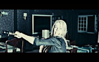 I had the idea that we could use a camera flash to light up the possessed boys face in different stages and not have any light between flashes so that the viewers couldn’t see what was happen. I looked into the different industries that made the horror films and had the best reputation in the horror film genre, and then watched some of the trailers that had been made by them.
 Target Audience
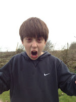
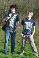 My target audience is males from the age of 15 and up. This is because the film would have a certificate of 15, which would mean that it has not been produced for anyone under that age. I also think that the target audience is males as all the characters in the film are male, and therefore it will be aimed more at a male audience. However, I do think that it would be watched by both males and females under that age, as the main character in the film is 13 years old. This will mean that people under the age of 15 will want to watch it, just because they can’t as they are too young. Also as the main character is so young, it will mean that other younger children can relate to it.
Strengths and Weaknesses
I think that the strengths of this film are the camera shots that we have chosen, and the editing that has been done. I think that we have a diverse range of camera shots that show the audience a good range of footage and clips. I think that the longest solid clip we have is about 5-6 seconds. This has allowed us to pace the film so that it can build whenever we want. I think that another one of the strengths is the location that we chose. It is the ideal place for a horror film to be set. It is a large house, amoung feilds, and with no one else around if things started to go wrong, which inevitably they would.
I think that the main weekness of the film is the narrative. As it was a film trailer, we had to think of the whole narrative for the story and then film the bits that would be important. However, I didnt want to film all the important parts of the film, as the idea of a trailer is to entise the audience to come and watch the rest of the film, but by showing all the main bits in the film, no enigma remains for the audience. I also think that another one of our weeknesses was the actors that we had. Some of the other actors we origonally chose, couldnt make it to all the filing sessions which meant that we had to get new actors and re-explain the whole story to them which lost us time when filming. However, the actors we ended up with did an amazing job.
Technical Skills - Shots and Editing
We had to use a large range of camera shots simply in order for us to achieve the level of diversity that we wanted in our film. We realised right from the start that if we had only a few different camera shots, then the audience would get bored and loose interest in what was going on. Also we knew that we had to have a large amount of camera shots and footage as we had to be able to pace the trailer towards the end, and pacing only works if there are a lot of different clips to use.
We used camera shots such as a bird’s eye view shot, a worms eye view shot, medium shots, wide angle shots, close ups, tracking shots, over the shoulder shots and zoom shots. We used all these because it means that the viewer doesn’t get tired of the same shots over and over again.
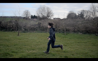 One of the tracking shots that we used was when we got Gabe (the main character) to run across the garden out the back of the house, and we had to run alongside him and make sure that the camera was always on him. This proved to be harder than we originally thought. Also the bird’s eye view shot was when Gabe opened the book for the first time and we saw the flash come out of it and him thrash his head back. We used this so that it looks like he has been over powered, and using a birds eye shot makes him look smaller and insignificant. This is therefore showing the power for of the sprit that possessed him.
 Editing

The best section of editing in the trailer I think is when Gabe opens the book and the flash comes out and we see him thrash his head back and his eye colour change, then as soon as he goes into this possessed state, he come back out of it. Furthermore I think that the slow motion effect that I have used also works well. For example, when we see Gabe walking outside with the book, he then drops it, and this section is shown in Slow Motion to give the action a more dramatic effect.
I also knew that it was very conventional of any trailer to have inter titles in. So i thought about short snappy words or phrases that would tell the story, explain the narrative, but not give to much away. They appear in the order:
Tired of rejection, Not knowing which way to turn, Something would happen, that would change his life forever.
Also, in the filming, we realised that we would have to get Gabe to do something that showed he was possessed and no longer human. So, we came up with the idea of walking through a wall. This was a good challenge for me as it was new Software and it would look amazing if it came out right. So instead of trying to fade him out, I resulted to making him disappear but looking like he had gone through the wall. This was achieved with some sleek, precise editing and the correct camera shots, and a flash effect over the footage to show that he had vanished.
In conclusion I think that the final trailer for this piece of coursework has turned out really well. We started out with a lot of crazy ideas and were able to implement some of them. The first draft and the final production have some similarities, such as the story line and features of the narrative, but the way we have shown them in the final production is much clearer and looks a lot more professional than what we started with. Overall I am very pleased with the end result and look forward to doing something similar in the future.
Dom Aitken


